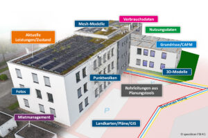
The importance of accessibility in Facility Management (FM) is continuously increasing, as companies and public institutions are focusing more on creating inclusive work environments. Accessibility, especially in the public sector, is not just a legal requirement but also a crucial factor for social responsibility and the well-being of all employees. Consequently, a modern Computer-Aided Facility Management (CAFM) system must also be able to present its content in an accessible manner.
To achieve this, a CAFM system must consider various aspects. Based on numerous accessibility-related projects carried out by speedikon FM AG, several key factors have emerged, including:
-
Compatibility of the CAFM system with screen readers
-
Use of appropriate fonts and colors, with high contrast
-
Clear highlighting of active elements on the home and navigation pages
-
Navigation and system operation via keyboard
-
Scalable user interface
-
Ability to use alternative text descriptions
Screen Reader Optimization
A particularly important aspect is compatibility with screen readers. These software tools read screen content aloud for visually impaired users, helping them navigate the system. We have adjusted navigation elements to ensure they are correctly interpreted by screen readers. Users now receive precise information about where and when input is required.
Font Sizes and Highlighting
The default font sizes and colors meet the requirements for good readability. Sans-serif fonts and positive text-background polarity are used. The browser’s zoom function allows users to adjust the text size individually. On the start and navigation pages, as well as in command bars and dialogs, the active element is clearly focused.
Customizable Marking of Required Fields
Another important point concerns the marking of mandatory fields. Previously, these fields in speedikon C were highlighted in red, which can be problematic for individuals with red-green color blindness. Now, both the color and an additional indicator (e.g., an asterisk) are preset across the system and can be adjusted if needed.
Optimized Use Through Special Adjustments
For visually impaired users, we have also optimized the search engine and command bar by hiding unnecessary elements. This allows navigation exclusively via the keyboard using tab keys. With this simplified operation, people with disabilities can, for example, efficiently process helpdesk messages.
Image : barokahselalu777/Freepik.com