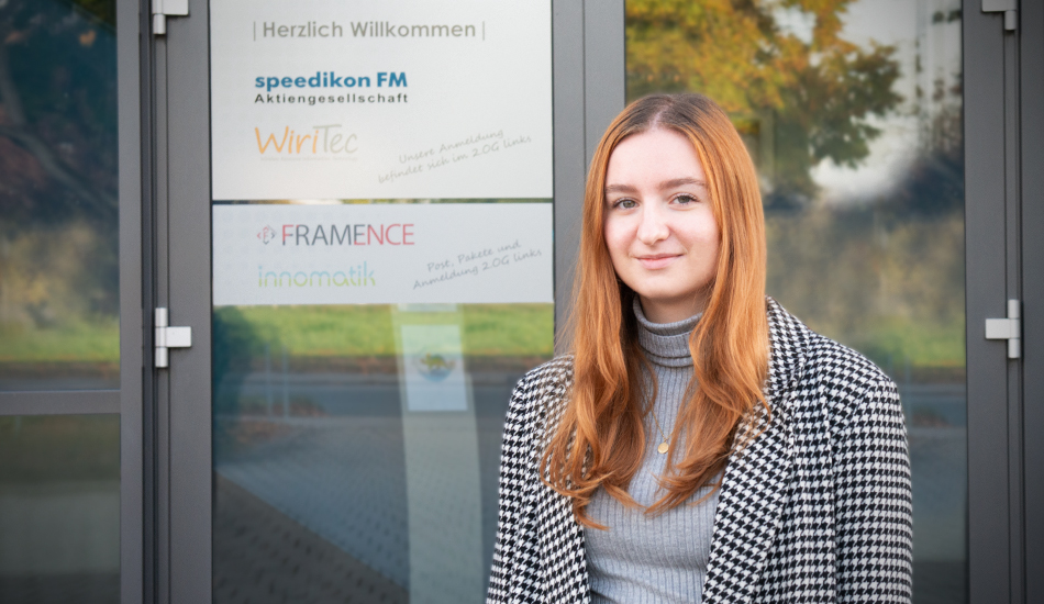
We’re delighted to share a new story from our team. Lena, our intern, recently completed her bachelor’s degree — a wonderful occasion to highlight the great work she has done during her time at speedikon FM AG, especially her contribution to making our software more inclusive through accessible icons.
As part of her internship, Lena focused on modernizing user interfaces and improving usability across several applications. She worked on the design and implementation of frontend features for platforms such as Inno:scribe, which is an AI that Innomatik trained to transcribe and summarize meeting notes in order to create meeting reports, and Inno:docs, a smart chatbot that enables employees to access company knowledge via natural language questions by drawing on uploaded documents. A key part of her role was also the creation and refinement of accessible icons for speedikon® C, as well as of new features for our defect management app in close collaboration with the development team.
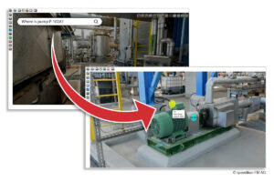
The app enables users to record and document defects directly on site, even offline, and synchronize the information with the speedikon® C platform for fast and efficient processing.
What are accessible icons?
Accessible icons are designed to be understandable and usable for as many people as possible — regardless of visual or cognitive impairments. In speedikon® C, for example, multiple functions sometimes shared the same icon, which made it difficult to distinguish between them. To make the icons more accessible, it is important to use strong color contrasts and avoid light tones or fading effects. Clear, simple, and well-defined visuals help ensure that icons can be recognized quickly and reliably.
For Lena, this was an exciting design challenge. “I found it exciting to see how icons can be designed so that they’re as understandable and accessible as possible for all users,” she explained.
Turning complex functions into simple visuals
One of the biggest challenges Lena faced during the project was translating complex software functionalities into small, clear, and consistent icons. Each symbol needed to stand out while still fitting harmoniously into the overall design.
Through this process, she gained a deep understanding of both the software and the principles of intuitive icon design. Contributing to the further development of the icon library allowed her to help make the interface more modern, accessible, and user-friendly. She also honed her skills in Adobe Illustrator — learning how essential it is to truly master the design tools to develop the right visual language.
Why accessibility matters
For Lena, accessibility in software is more than just a design consideration — it’s about ensuring that everyone can participate equally in the digital world. Accessible interfaces enable people with visual, auditory, mobility, or cognitive impairments to use digital tools with the same ease as everyone else.
This topic is also becoming increasingly important due to legal requirements such as the EU standard EN 301 549, which makes accessibility in software mandatory. Inclusive design is therefore not only a matter of social responsibility but also a key factor for future-proof digital products.
Looking ahead
With her bachelor’s degree now complete, Lena plans to continue her path in frontend development — ideally in a setting where design, usability, and development come together.
We’re proud of our intern Lena and her contribution to the accessible icons project. Her work is a great example of how thoughtful design can make technology more inclusive for everyone.
Want to learn more about accessibility in software? Read our other article: This is what accessible CAFM software must be able to do or contact us at info@speedikonfm.com
Picture: speedikon FM AG